[A, SfS] Chapter 1: Sampling, Descriptive Statistics, Intr: 1.5: Distribution of Quantitative Data
 The Distribution of Quantitative Data
Distribution of Quantitative Data
In this lesson, you will start to learn how to use graphical tools.
#\text{}#
Given a set of measurements on a variable at a quantitative measurement level, we often wish to know how the measurements are distributed among the possible values.
Histogram
A histogram is a useful tool to determine how a given set of measurements are distributed among the possible values of a quantitative variable.
A histogram is usually created using software.
Creating a Histogram
If you were to create a histogram yourself, you would do the following:
1. Determine the range of your measurements:
- The minimum value #m#
- The maximum value #M#
- The distance between them #d = M - m#
#\text{}#
2. Decide how many vertical bars you would like for your histogram.
- The more bars you use, the more detail you can see.
- Too many bars means you can see too much detail while missing the big picture.
- Usually you want to have between #5# and #10# bars. Suppose you choose #k# bars.
#\text{}#
3. The bin size is then #w=\frac{d}{k}#. Choose an appropriate integer #i# smaller than #m# as a starting point.
- The first bin is the interval #[i,i+w]#.
- The second bin is the interval #(i+w,i+2w]#.
- The third bin is the interval #(i+2w,i+3w]#.
- We continue in this manner, so that the last bin is the interval #(i+(k-1)w,i+kw]#.
Mark these bins on the horizontal axis.
#\text{}#
4. Count how many measurements in your data set that fall within each bin, i.e., the frequency for that bin.
#\text{}#
5. For each bin, make a rectangle whose height is the number of measurements in that bin, marked on the vertical axis, and whose width is #w#.
#\text{}#
From a histogram, we can observe the general shape of the distribution of a quantitative variable.
Symmetric Distributions
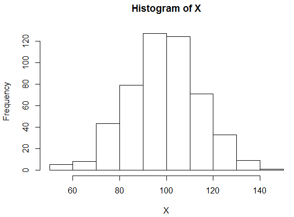
If the measurements are distributed equally around the middle of the distribution, we say that the distribution is symmetric.
Symmetric Histogram

Here we see that the middle of the distribution is around #100#, with the decrease in the frequencies on each side of #100# being approximately the same on both sides of #100#.
We can also see that the measurements fall between #50# and #150#, with the majority between #80# and #120#.
#\text{}#
Right-skewed Distributions
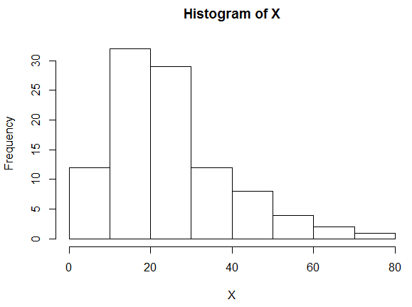
It might be that the majority of the measurements are clustered at the lower values of the variable at the left side of the histogram, and the frequencies decrease as the value of the variable increases.
In this case, we say that the distribution is skewed to the right.

Here we can see that the measurements fall between #0# and #80#, but most of them fall between #0# and #40#.
It is harder to say where the middle of the distribution is, but think about where you would have to put your finger on the horizontal axis if you wanted to balance the histogram on the tip of your finger.
#\text{}#
Left-skewed Distributions
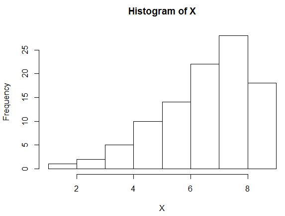
Another possibility is, of course, that the measurements are concentrated at the higher end of the range of the variable, on the right side of the histogram.
Then we would say that the distribution is skewed to the left.

#\text{}#
There are many other possibilities for the shape of a distribution. In any case, especially if there are very many measurements, we can get a good idea about how the variable is distributed within the population from which the measurements are taken based on the histogram of the measurements.
#\text{}#
Using R
Histograms
Suppose you have measurements on a quantitative variable stored in a vector named #\mathtt{Population}# in your #\mathrm{R}# workspace.
To make a histogram of these data, use:
> hist(Population)
#\text{}#
You can adjust the degree of detail by specifying how many bins you would like to have, using the #\mathtt{breaks=}# setting.
> hist(Population, breaks=20)
#\text{}#
For additional options, use the #\mathrm{R}# help page:
> ?hist

Or visit omptest.org if jou are taking an OMPT exam.


